
Без рубрики
Search engine optimization (SEO) very much revolves around Google today. However, the practice we now know as SEO actually pre-dates the world’s most popular search engine co-founded by Larry Page and Sergey Brin.
Although it could be argued that SEO and all things search engine marketing began with the launch of the first website published in 1991, or perhaps when the first web search engine launched, the story of SEO “officially” begins a bit later, around 1997.
According to Bob Heyman, author of “Digital Engagement,” we can thank none other than the manager of rock band Jefferson Starship for helping give birth to a new field that we would grow to know as “search engine optimization.”
You see, he was quite upset that the official Jefferson Starship website was ranking on Page 4 of some search engine at the time, rather than in Position 1 on Page 1.
Granted, we may never know if this tale is more revisionist history or 100 percent fact, all signs definitely point to the term SEO originating around 1997.
Do a little more hunting around and you’ll see John Audette of Multimedia Marketing Group was using the term as early as February 15, 1997.
Ranking high on search engines in 1997 was still a pretty new concept. It was also very directory driven. Before DMOZ fueled the original Google classification, LookSmart was powered by Zeal, Go.com was its own directory, and the Yahoo Directory was a major player in Yahoo Search.
If you’re unfamiliar with DMOZ, the Mozilla Open Directory Project (remember, Mozilla was a company and Moz was a brand well before SEOMoz), it was basically a Yellow Pages for websites. Which is what Yahoo was originally founded upon, the ability to find the best websites out there as approved by editors.
I started doing SEO in 1998, as a need for our clients who have built cool sites but were getting little traffic. Little did I know, it would become a lifestyle.
Then again, the World Wide Web was still a pretty new concept at the time to most people.
Today? Everybody wants to rule the search engine results pages (SERPs).
Search Engine Optimization vs. Search Engine Marketing
Before Search Engine Optimization became the official name, other terms were used as well. For example:
- Search engine placement
- Search engine positioning
- Search engine ranking
- Search engine registration
- Search engine submission
- Website promotion
But no discussion would be complete without mentioning another term: Search Engine Marketing.
At one point in 2001, one prominent industry writer suggested search engine marketing as a successor to search engine optimization.
Obviously, it didn’t happen.
Prepare yourself now: you’re going to see many false claims (e.g., “SEO is dead” “the new SEO”) and attempts at rebranding SEO (“Search Experience Optimization”).
While SEO as a term isn’t perfect – after all, we aren’t optimizing search engines, we’re optimizing our web presence – it has remained the preferred term of our industry for 20 years now and likely will be for the foreseeable future.
As for Search Engine Marketing – it is still used but is now more associated with paid search. The two terms co-exist peacefully today.
A Timeline of Search Engine History
Search engines have changed the way we find information, conduct research, shop for products and services, entertain ourselves, and connect with others.
Behind almost every online destination – whether it’s a website, blog, social network, or app – is a search engine. Search engines have become the connecting force and directional guide to everyday life.
But how did this all start?
We’ve put together a timeline of notable milestones from the history of search engines and search engine optimization to understand the roots of this technology, which has become such an important part of our world.
Dawn of SEO: “The Wild West” Era
In the last decade of the 1900s, the search engine landscape was highly competitive. You had your choice of search engines – both human-powered directories and crawler-based listings – including the likes of AltaVista, Ask Jeeves, Excite, Infoseek, Lycos, and Yahoo.
In the beginning, the only way to perform any kind of SEO, was through on-page activities. This included making sure the content was good and relevant, there was enough text, your HTML tags were accurate, and that you had internal and external links, among other factors.
If you wanted to rank well in this era, the trick was pretty much just repeating your keywords enough times throughout your webpages and meta tags. Want to outrank a page that uses a keyword 100 times? Then you’d use the keyword 200 times! Today, we call this practice spamming.
Here are some highlights:
- 1994: Yahoo was created by Stanford University students Jerry Wang and David Filo in a campus trailer. Yahoo was originally an Internet bookmark list and directory of interesting sites. Webmasters had to manually submit their page to the Yahoo directory for indexing so that it would be there for Yahoo to find when someone performed a search. AltaVista, Excite, and Lycos also launched.
- 1996: Page and Brin, two Stanford University students, built and tested Backrub, a new search engine that ranked sites based on inbound link relevancy and popularity. Backrub would ultimately become Google. HotBot, powered by Inktomi, also launched.
- 1997: Following on the success of A Webmaster’s Guide to Search Engines, Danny Sullivan launched Search Engine Watch, a website dedicated to providing news about the search industry, tips on searching the web, and information about how to rank websites better. (Ten years later, after leaving SEW, Sullivan founded another popular search publication, Search Engine Land.) Ask Jeeves also debuted and Google.com was registered.
- 1998: Goto.com launched with sponsored links and paid search. Advertisers bid on Goto.com to rank above organic search results, which were powered by Inktomi. Goto.com was ultimately acquired by Yahoo. DMOZ (the Open Directory Project) became the most sought-after place for SEO practitioners to get their pages listed. MSN entered into search with MSN Search, initially powered by Inktomi.
- 1999: The first-ever all search marketing conference, Search Engine Strategies (SES), took place. You can read a retrospective on that event by Sullivan here. (The SES conference series continued running under various monikers and parent companies until shutting down in 2016.)
The Google Revolution
In 2000, Yahoo pulled off the worst strategic move in the history of search and partnered with Google and let Google power their organic results instead of Inktomi. Beforehand Google was a little-known search engine. Hardly known! The end result: every Yahoo search result said “Powered by Google” and they ended up introducing their largest competitor to the world and Google became a household name.
Until this point, search engines mainly ranked sites based on the on-page content, domain names, ability to get listed in aforementioned directories, and basic site structure (breadcrumbing). But Google’s web crawler and PageRank algorithm were revolutionary for information retrieval. Google looked at both on-page and off-page factors – the quantity and quality of external links pointing to a website (as well as the anchor text used).
If you think about it, Google’s algorithm was essentially about “if people are talking about you, you must be important.”
Although links were only one component of Google’s overall ranking algorithm, SEO practitioners latched onto links as being the most important factor – and an entire sub-industry of link building was created. Over the next decade, it became a race to acquire as many links as possible in the hopes of ranking higher and links became a heavily abused tactic that Google would have to address in coming years.
It was also in 2000 that the Google Toolbar became available on Internet Explorer, allowing SEO practitioners to see their PageRank score (a number between 0-10). This ushered in an era of unsolicited link exchange request emails.
So with PageRank, Google essentially introduced a measure of currency to its linking. Much like domain authority is misused today.
Google’s organic results also got some company in the form of AdWords ads starting in 2000. These paid search ads began appearing above, below, and to the right of Google’s unpaid results.
Meanwhile, a group of webmasters informally got together at a pub in London to start sharing information about all things SEO in 2000. This informal gathering eventually turned into Pubcon, a large search conference series that still runs today.
Over the coming months and years, the SEO world got used to a monthly Google Dance, or a period of time during which Google updated its index, sometimes resulting in major ranking fluctuations.
Although Google’s Brin once famously said Google didn’t believe in web spam, his opinion had probably changed by the time 2003 rolled around. SEO got a lot harder following updates like Florida because it became much more important than just repeating keywords x amount of times.
Google AdSense: Monetizing Terrible SEO Content
In 2003, after acquiring Blogger.com, Google launched AdSense, which serves contextually targeted Google AdWords ads on publisher sites. The mix of AdSense and Blogger.com leads to a surge in monetized simple Internet publishing and a blogging revolution.
While Google probably didn’t realize it at the time, they were creating problems they would have to fix down the road. AdSense gave rise to spammy tactics and Made for AdSense sites filled with thin/poor/stolen content that existed solely to rank well, get clicks, and make money.
Oh and something else important happened in 2003. I founded the site you’re on, Search Engine Journal! And I’m incredibly happy to say we’re still here, going stronger than ever!
Local SEO & Personalization
Around 2004, Google and other top search engines started improving results for queries that had a geographic intent (e.g., a restaurant, plumber, or some other type of business or service provider in your city or town). By 2006, Google rolled out a Maps Plus Box, which I was quite impressed by at the time.
It was also around 2004 that Google and search engines began making greater use of end-user data, such as search history and interests, to personalize search results. This meant that the results you saw could be different than what another person sitting next to you in a coffee shop when searching for the same query.
Also in 2005, nofollow tags were created as a means to combat spam. SEO pros began using this tag as a way of PageRank sculpting.
Google also unleashed a couple of noteworthy updates:
- Jagger, which helped to diminish the level of unsolicited link exchanges that were flying around, as well as heralding the decline in the importance of anchor text as a factor due to its corruptibility.
- Big Daddy (coined by Jeff Manson of RealGeeks), which improved the architecture of Google to allow for improved understanding of the worth and relationship of links between sites.
YouTube, Google Analytics & Webmaster Tools
In October 2006, Google acquired user-generated video sharing network YouTube for $1.65 billion, which ultimately became the second most used search property in the world.
Today, YouTube has more than a billion users. Due to its soaring popularity, video SEO become crucial for brands, businesses, and individuals that wanted to be found.
Google also launched two incredibly important products in 2006:
- Google Analytics. This free, web-based tool was so popular at launch that webmasters experienced downtime and maintenance warnings.
- Google Webmaster Tools. Now known as the Search Console, Google Webmaster Tools let webmasters view crawling errors, see what searches your site showed up for, and request reinclusion.
Also in 2006 XML sitemaps gained universal support from the search engines. XML sitemaps allow webmasters to display to the search engines, every URL on their website that is available for crawling. An XML sitemap contains not only a list of URLs but a range of further information, which helped search engines to crawl more intelligently.
Universal Search
We really began to see search starting to evolve in new and exciting ways starting in 2007. All of these updates were aimed at improving the user experience.
Let’s start with Google’s Universal Search. Until this point, the search results had consisted of 10 blue links.
Then Google began blending traditional organic search results with other types of vertical results like news, video, and images. This was easily the biggest change to Google search – and SEO – since the Florida update.
Cleaning up the Cesspool
In 2008, then-Google CEO Eric Schmidt said the Internet was becoming a cesspool and that brands were the solution. “Brands are how you sort out the cesspool,” he said.
Less than six months after his comment, along came a Google update called Vince. Big brands suddenly seemed to be ranking a whole lot better in the SERPs.
But it wasn’t really intended to reward brands, according to Google. Google wanted to put a greater weight on trust in the algorithm (and big brands tend to have more trust than smaller and less-established brands).
Shortly after this update, Google releases another to improve the speed of their indexing, called Caffeine. As SEJ reported at the time, Caffeine was “a next-generation search architecture for Google that’s supposed to be faster and more accurate, providing better, more relevant results and crawling larger parts of the web.”
Speaking of speed, in 2010 Google announced that site speed was a ranking factor.
Bing & The Search Alliance
In 2009, Microsoft Live Search became Bing. Then, in an attempt to challenge Google’s nearly 70 percent grip of the U.S. search market, Yahoo and Microsoft joined forces to partner on a 10-year search deal (though it ended up being reworked five years later).
The Search Alliance saw Microsoft’s Bing power Yahoo’s organic and paid search results. While it made Bing the clear Number 2 search engine, they ultimately have failed to break Google’s massive grip on search in the U.S. and globally.
The Rise of Social Media
Another phenomenon was emerging late in the 2000s – social networks.
Google made its big bet on YouTube (although it would try again with Google+). But other networks like Facebook, Twitter, and LinkedIn all emerged as major players (with many more to come and go in the following years).
Along with the rise of social media came speculation that social signals can impact search rankings. Yes, social media can help SEO, but indirectly – just as other forms of marketing can help drive more traffic to your website and increase brand awareness and affinity (which generates search demand).
While the impact of social shares (likes, tweets, +1’s, etc.) has been denied time and again by Google through the years as being ranking factor, it continued to be listed as having a strong correlation in various ranking factor studies. If you want to read more about this topic, I highly suggest reading How Social Media Helps SEO [Final Answer].
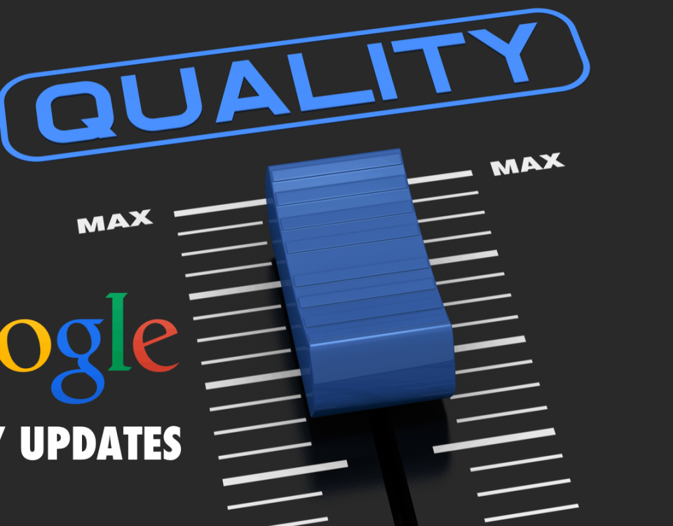
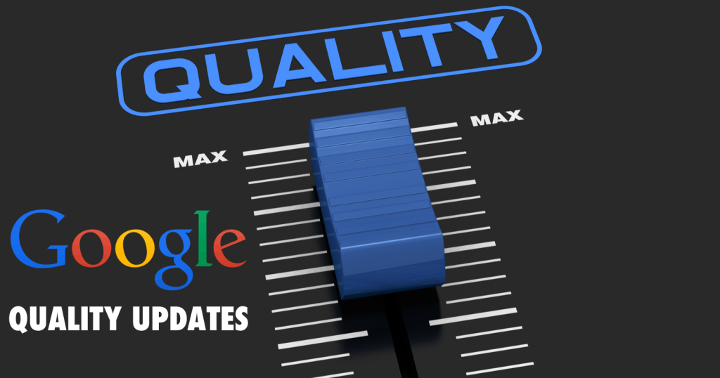
The Google Zoo: Panda & Penguin
Two major algorithmic updates, in 2011 and 2012, had a big impact on SEO that is still being felt to this day as Google once again attempted to clean up its search results and reward high-quality sites.
In 2011, Google found its search results facing severe scrutiny because so-called “content farms” (websites that produced high volumes of low-quality content) were dominating the search results. Google’s SERPs were also cluttered with websites featuring unoriginal and auto-generated content – and even, in some instances, scraper sites were outranking content originators.
As a result, these sites were making tons of advertising revenue (remember when I mentioned Google’s self-made AdSense problem?). These sites were also living and dying by organic traffic from Google.
But once Google’s Panda update rolled out in 2011, many websites saw much, if not all, of that traffic vanish overnight. Google provided some insight on what counts as a high-quality site.
Aimed at eliminating low-quality (or thin) content, Panda was updated periodically over the coming years, eventually becoming integrated into Google’s core algorithm in 2016.
With websites still recovering from the effects of Panda, Google unleashed a hotly anticipated over-optimization algorithm, intended to eliminate “aggressive spam tactics” from its results. Eventually dubbed Penguin, this algorithm targeted link schemes (websites with unusual linking patterns, including a high-amount of exact match anchor text that matched keywords you wanted to rank for) and keyword stuffing.
Penguin wasn’t updated nearly as frequently as Panda, with more than a year passing between some updates. And, like Panda, Penguin became part of Google’s real-time algorithm in 2016.
Things, Not Strings
In May 2012, Google unveiled the Knowledge Graph. This was a major shift away from interpreting keywords strings to understanding semantics and intent.
Here’s how Google’s Amit Singhal, SVP, engineering, described it at launch:
“The Knowledge Graph enables you to search for things, people or places that Google knows about – landmarks, celebrities, cities, sports teams, buildings, geographical features, movies, celestial objects, works of art and more – and instantly get information that’s relevant to your query. This is a critical first step towards building the next generation of search, which taps into the collective intelligence of the web and understands the world a bit more like people do.”
Google enhanced its search results with this information. Knowledge panels, boxes, and carousels can appear whenever people do a search for one of the billions of entities and facts in the Knowledge Graph.
The next step in Google’s next generation of search came in September 2013 in the form of Hummingbird, a new algorithm designed to better address natural language queries and conversational search. With the rise of mobile (and voice search), Google needed to completely rebuild how its algorithm worked to meet the needs of modern searchers.
Hummingbird was considered to be the biggest change to Google’s core algorithm since 2001. Clearly, Google wanted to deliver faster and more relevant results, especially to mobile users.
Mobile-First
Starting somewhere around 2005 or so, one question kept being asked in our industry. Is this the “Year of Mobile”?
Well, it turns out that it wasn’t in 2005. Or 2006. Neither was 2007. Or 2008. Or 2009. Not even 2010 – when Google transformed itself into a mobile-first company.
Then 2011, 2012, 2013, and 2014 came and went. Mobile was talked about and much hyped because it was growing like crazy all this time. As more users adopted smartphones, they were increasingly searching for businesses and things while on the move.
Finally, in 2015, we had the Year of Mobile – the point at which mobile searches overtook desktop search for the first time on Google. And while this is true in terms of raw search numbers, it’s also true that search intent is quite different and conversion rates remain much lower on mobile devices.
This was also the year that comScore reported mobile-only internet users surpassed desktop-only users.
It was also in 2015 that Google launched a much-anticipated mobile-friendly algorithm update, designed to give users “the most relevant and timely results, whether the information is on mobile-friendly web pages or in a mobile app.”
In an attempt to speed up pages, Google also introduced Accelerated Mobile Pages (AMP) in 2016. AMP are designed to instantly load content and mostly has been adopted by news media and publishers.
And there’s much more mobile to come. Next up: a mobile-first index is on the way sometime in 2018.
Machine Learning, AI & Intelligent Search
Earlier, I mentioned that Google, originally built around information retrieval, became a mobile-first company. Well, that changed in 2017 because Google CEO Sundar Pichai declared Google an AI-first company.
Today, Google search is designed to inform and assist, rather than giving users a list of links. That’s why Google has built AI into all of its products – including search, Gmail, AdWords, Google Assistant, and more.
In terms of search, we’ve already started to see the impact of AI with Google RankBrain. Announced in October 2015, RankBrain was initially used to try to interpret the 15 percent of searches that Google has never seen before, based on the words or phrases the user has entered.
Since that time, Google has expanded RankBrain to run on every search. While RankBrain impacts ranking, it isn’t a ranking factor in the traditional sense, where you get rewarded with better rankings for doing x, y, and z.
And there’s much more coming soon in the world of intelligent search.
Voice searches are increasing. Visual search has gotten insanely good. And users (and brands) are increasingly adopting chatbots and using personal assistants (e.g., Apple’s Siri, Amazon’s Alexa, and Microsoft’s Cortana).
Exciting times are ahead for SEO.
Conclusion
Search engines and SEO have come a long way since the 1990s. And we’ve only touched on a few of these ways in this post.
The history of SEO has been filled with exciting turns – the birth of new search engines, the death of old search engines, new SERP features, new algorithms, and constant updates, plus the emergence of great SEO publications, conferences, tools, and experts.
While search engines and SEO have evolved greatly over the years, one thing remains true: as long as there are search engines, SEO will remain vital. And we’ve only gotten started!

