
5 principles of typography
Typography — a critical element of any design project, whether it be print production or web design. No one website or a poster will not look complete without text. But not enough to just add the text. It is important to properly locate it on the page, taking into account many factors. On this and will talk today.
We consider the typography on the site in terms of composition. You will learn how to balance the text on the page. Strict rules in this area a little bit, because all projects are different and each case requires individual approach. But if you learn the rules of creating readable text in web design, you will be halfway to a balanced layout.
The vertical distance
Much of the success in the construction of the composition lies in the understanding of space. In our case, the most important factor is the vertical distance between the text elements. We are talking about various elements, such as headings, paragraphs, and of course line within a paragraph.
Usually sites use different CSS styles for headings and paragraphs. In this case, the text remains legible, even if a large amount of free space is not necessary. Also count space between paragraphs. If it is too short, the text will appear as a continuous web. If it is too much, the user will have to scroll too often.
The vertical space between lines is called leading. It can be changed in the property CSS line height and the option for normal text should be different from the setting for the header. You can also provide more space under the text boxes to add air.
The hierarchy of content
Another important element — the hierarchy of the content on the page. Usually plain text paragraphs, compared with headlines and callouts are less of a priority. Try to design and organize the elements in terms of hierarchy, for a while forgetting about the content.
The headings h1 should be more noticeable than the headers of the second and third level (h2 and h3). This rule is not always used, in certain cases it can be to retreat, but usually for the best results is useful to comply with the pyramidal structure of the HTML elements. Paragraphs important to establish a single registration for selected text, bold text, and links.
Think of each design element, make it stand out or harmoniously combined with the rest of the content.
Differentiate forums
A small number of fonts to be used on the entire website. But in order to highlight areas of the site change the text properties: size, thickness, the case of letters, kerning. Thus, you will create the impression that the content is changed or some other higher priority areas.
However, it is not necessary to visually differentiate the sections using the text formatting. In this case, you will also help the different values of free space, and graphic elements that will help to share the headlines, navigation, content area and footer. It should nevertheless be noted that a number of sites for this purpose used a different color of the font.
So, your goal is to allow the eye to rest in a place of free space between partitions. It is also desirable that the colors work in your favor, playing the role of the intuitive prompts. Although color theory — another topic, this option is important as the typography in web design, as well as in the printing industry.
Size in relative units
The web design is better to specify the text size in relative units. You can use the «%» or «em», to provide the text of the flexibility and adaptability. The author prefers to use the «em», since this parameter depends on the DPI (dots per inch) and resolution of the user’s monitor. Usually it is based on the size of the fonts installed by default in the browser.
These fonts will also be tailored to fit the screens of mobile devices, so «%» and «em» — the best solution to create adaptive layouts. But the non-adaptive sites will also benefit by using relative units.

Size in «px» indicate sense only if the font should remain the same size in any way, or it is placed in the non-adaptive container. For example, when it comes to price table with the specified width of 600px. If the font will grow on large monitors, it can go beyond the limits of the container. Of course, you can make a table of adaptive, but this solution is not always suitable.
For most of the projects still avoid using pixels for font sizes. Of course, this is the original meaning of the fonts on the Web, and many designers are accustomed to this type of designation, thanks to Photoshop and other tools. However, we must take into account the diversity of all the currently existing screens and make more flexible solutions.
Contrast and color matching
Anyone would prefer to read text on a contrasting background with typography. Contrast should play an important role in selecting the colors for text and background. How to test colors on a sufficient contrast? You can use a free online tool contrast checker, which will help you in this.
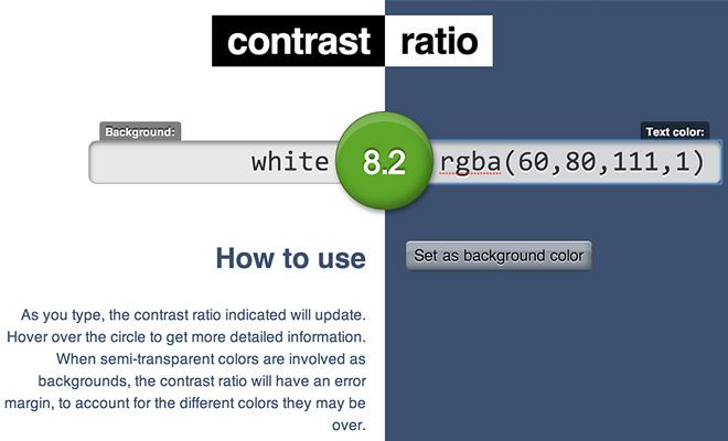
You enter the value of the color of its name (black, white, grey) or digital HEX / RGB values for text and background. Moreover, you can even specify a repeating background using url () . You will immediately be able to see how the color will look and how they are contrasting. Also, the contrast ratio on the screen would be specified in a range from 0 to 100.
If you are not an expert in color theory, this tool can save time. Also remember that it is always a good enough contrast different shades of the same color. That is, you can take the color and combine it light and dark shades.
As in any business, work with typography becomes easier and faster experience. Do not be afraid and be ready for more victories and defeats, before becoming the spices in this area. Now that you are armed with the above ideas, go to a variety of popular sites and see how they are implemented in specific cases. You can learn a lot by studying other people’s good work.