7 Best Character Design Tips for Web Designers

Being familiar with the best character design tips can help you use illustrations in web design in a smart way. Whatever solutions excite creative minds, the illustrative approach has always found its way to the web design sphere—whether we were all obsessed with flat principles or digitally reproduced real-life objects.
Using illustrations in web design has its own trends. For instance, showing cartoonish characters in the hero section prevails nowadays. You can see it here, there, and pretty much everywhere.
The reason is simple: both old and young people love cartoons. They are not simply a fun or pleasant way to while away the time. Since childhood, we are accustomed to learning stuff from animated movies. They bring us something new, feed our curiosity, and explain complicated things. So, they can be pretty beneficial for websites dealing with non-tech-savvy people who require explanations and clarifications.
The Best Character Design Tips
Cartoonish characters are able to support messages you want to convey to your target audience and enhance the user experience from various sides, making your website a pleasant place to be. There are various ways to take advantage of this approach.
Below, you can find the seven best character design tips for web designers with real-life examples that might help you get better with illustration in web design.
1. Use Human Characters
As I’ve mentioned earlier, whether you have an online service that lets tech-savvy people be more efficient or just a web application that helps ordinary people run their businesses without hustle and bustle, chances are those people might find themselves confused while exploring your website.
To overcome this obstacle, use human characters engaged in daily situations. The human touch in a “cold” digital environment will certainly make the website familiar to the user. As an example, consider the homepage of Netwise.
While the company’s name does not say much, the hero area illustration certainly speaks volume. You can see here a whole bunch of people who are doing some stuff. It inspires trust and tries to make complicated things simple by promising you to do all the heavy lifting for you.
![]()
2. Make Things Brutally Clear
Sometimes all you need is brutal honesty, or in the case of website design: clarity. We all appreciate intricacy in projects. However, there are some situations where obviousness is preferable. What you see is what you get is the first rule of good relationships with the online crowd. Besides, this principle is also the foundation of one of the best character design tips you need to know about.
To avoid confusion in the first place, you should use an illustration that clears things up from the first seconds, as Absurd Design does it on their website. Even though the name is pretty obvious, it’s still hard to guess what it really means. What kind of absurd designs are they talking about? To answer the question and spark interest in users, the team has used a representative artwork that says it all.
![]()
3. Use Funny Animal Mascots
If, on the contrary, your business is self-explanatory and doesn’t need any introduction, you might want to make it stand out from the crowd with the help of smart character design. This is when a funny animal mascot can save the day by turning a banal website into an enjoyable project.
Just take a look at Oboosho‘s website. The website presents a cleaning service. Boring, isn’t it? Not this time, at least not while this adorable hippo character is watching you. It lightens the mood and makes the atmosphere cheerful and pleasant. And, it lures you in with its outstanding charisma, indeed.
![]()
4. Show Routine with Animated Characters
Animations are the new black of these days. And, you should use it to your advantage. In fact, the animation doesn’t have to be something big; a small animated piece can easily do the trick. It will naturally support the message of your brand and give some hints to the user. It won’t overwhelm your visitors, either. As an example, consider the website design of Zapare Technologies.
The team goes for a small hero illustration that is carefully being set in motion. It shows the daily routine in an office in a fancy way. As a result, it establishes a positive and inviting atmosphere and inspires trust straight away when the user lands on the website.
![]()
5. Call for the Audience’s Associations
Unless you are building a website that concerns burning social issues such as famine or natural disasters, the playful factor is your loyal friend in a battle of winning over clients. You can create a playground where dynamic canvas lies at heart, but if you need to employ illustrations you can always try to use associations.
In such a way, you will give people some food for thought and remind them of some good moments that evoke positive feelings. If you want to see a good example check out the design of Alber Graphics.
Alber Graphics is an everyday design agency. However, their website makes another statement. Taking Alice in Wonderland as a source for inspiration, the team has managed to create a unique website where messages are skillfully supported by witty illustrations. A smart and neat solution and also one of the best character design tips you will find.
![]()
6. Inspire Confidence by Using a Superhero
Let’s be honest, we are used to equating ourselves with cartoon heroes: saving the world and doing all the incredible stuff. Even though we are now serious grown-ups, we all know that childhood habits die hard. And, we can use this for our good.
Cartoonish characters, especially superheroes, inspire confidence in people on a subconscious level. You can trigger this effect by using a hand-drawn self-portrait enhanced with some hero features.
As an example, consider a personal portfolio of Salvatore Casalino. Isn’t it lovely? The website catches the user’s attention without much effort. Moreover, it makes a promise about doing its best to sort out all the issues you might have.
![]()
7. Experiment with Various Styles
The illustrative approach is one of those things that have the ability to cooperate flawlessly with various mainstreams. Depending on the purpose and theme of your website, you can use different types of illustrations—especially nowadays, when diversity is highly praised and appreciated. Take a look at two fantastic examples that prove this in practice.
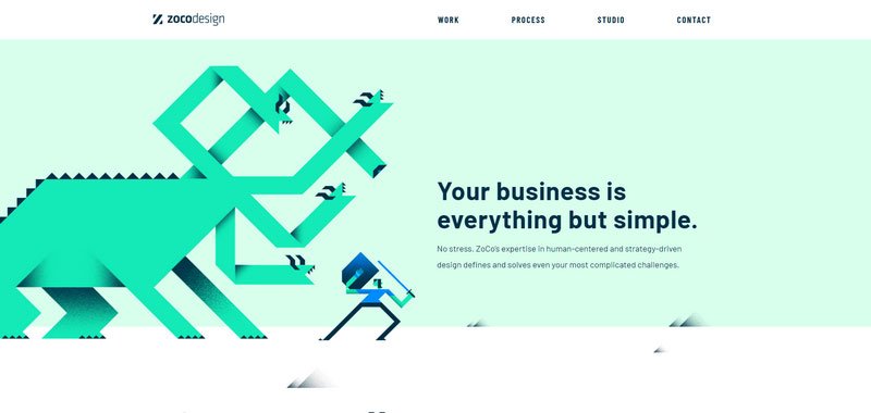
The team behind ZoCo Design opts for flat 2.0 principles. They use a mythical creature to make the welcome section memorable, distinguishing themselves from the competition in a unique way.
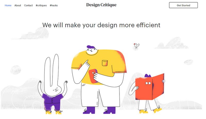
And, the creatives behind Design Critique make use of hand-drawn illustrations to show the designer’s love for originality and art. In this way, they manage to stand out from the crowd without much effort.


Conclusion
Cartoonish characters are powerful tools. They are able to enhance and enrich user experience but still retain their playful and adorable nature. Calling for our inner child, they make our visit on the website pleasant and comfortable. They bridge the gap between us, regular online crowd, and the website owner—laying down the foundations of a good relationship.
