
Без рубрики
Punctuation? Grammar? UX design? What?
Yes, you heard me! Punctuation and grammar is vital for an optimal reading experience, and in turn, an optimal userexperience. A simple comma can be the difference between a text making complete sense, or not making sense at all.
Web design is approximately 95% typography. This was true 11 years ago and it’s still true today. When copywriters think about their words from a user experience perspective, or when designers invest more of their time improving as a writer, the readability and engagement of the content can be exponentially improved. Like the saying goes, “Content is king”.
Let’s take a look at some ultra-important punctuation marks that can drastically improve the readability and understanding of the written words (beyond the basics — colons, commas and full stops). We’ll discuss ampersands, capitalisation and the dashes.
Ampersand
An ampersand is a logogram meaning “and”, originating from the ligatures “et”, which is Latin for “and”. Most of us know the meaning of an ampersand already, but aren’t exactly sure of when it’s acceptable to use it.
I must admit, I used it incorrectly for a number of years!
When you shouldn’t use an ampersand:
Don’t use ampersands in sentences. Sentences should be composed of natural language, they’re designed to “speak” to the user in a conversational, humanlike way. People resonate (and are more likely to convert to/engage with) content and user interfaces when the language feels friendly and conversational.
When you should use an ampersand:
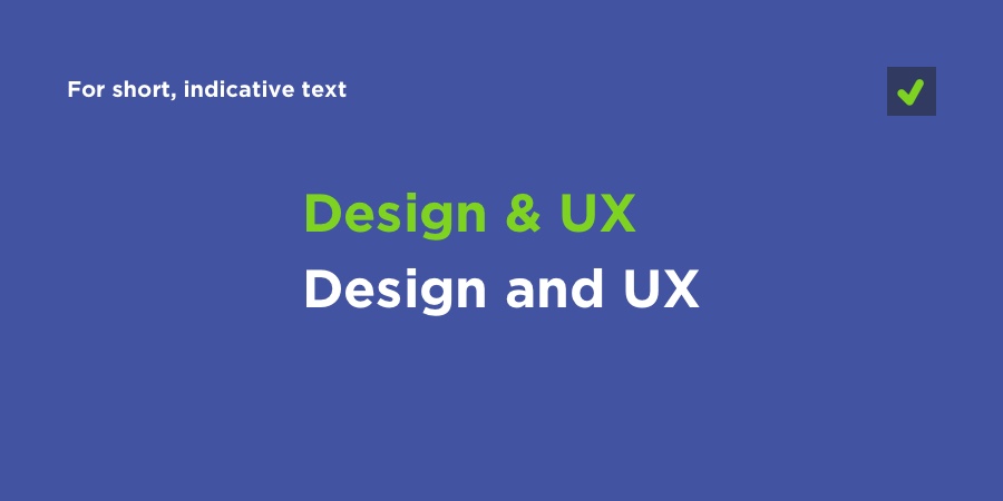
Let’s say that you have a blog category about design and UX. In this case, the user isn’t looking to be swayed, engaged, enticed or informed — the user is looking for indication. The user wants to locate and click on that link to the category, so this is where a conversational tone of voice becomes less useful.
“Design and UX” is fine, but “Design & UX” is shorter and thus clearer and more direct. It’s quite likely that this blog also has many other categories of interest, so an ampersand takes up less space and allows more menu items in the navigation.

So, use “and” in sentences and texts that require natural language, and use an ampersand for anchor text and short headings.
Lowercase, Uppercase…Titlecase?
Why do we use titlecase in headings?
Interesting question. It’s actually much more than a formality, there’s a solid UX-related reason for using titlecase in titles, headings and headlines.
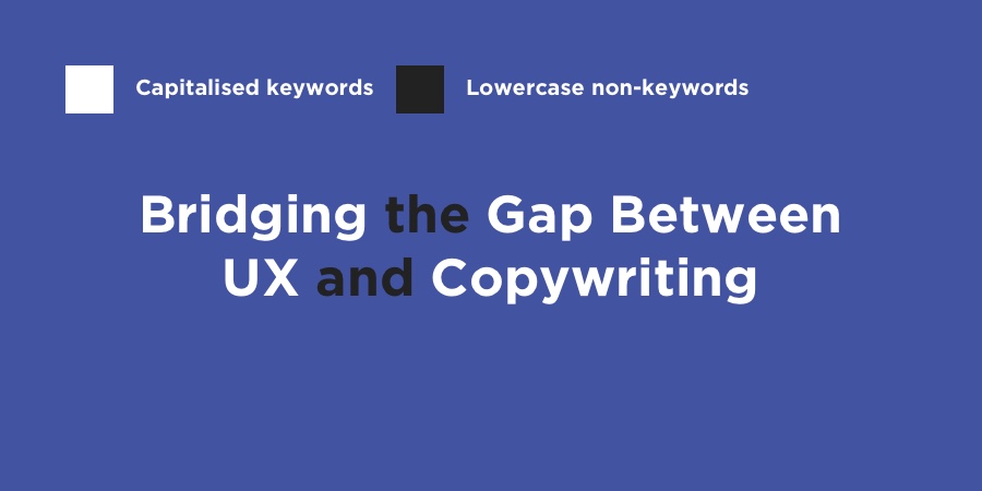
Readers use headings to summarise content before they dive into the sentences, and they also focus more on the keywords in those headings. In a world where online content is so accessible, readers are being picky with what they read.
When choosing a title, the lowercase words are the words that could be removed. In the title of this very article, “Bridging the Gap Between UX and Copywriting”, the words “the” and “and” could be removed and the title will still make sense. We still need to include them in the title for readability reasons (remember what I said about natural language), but we can make them less visible by forcing lowercase.
Capitalisation and Uppercase Letters
Pretty much all texts start with a capital letter, but what about uppercase? Uppercase letters are harder to read because of the lack of legibility (the ability to distinguish between individual letters) — when a statement appears in uppercase, each letter is the same height, so it’s harder to tell one letter from the other.
Not impossible, but harder.
Headings and titles in uppercase can certainly make a bolder impact, but it should be noted that uppercase works best with shorter texts. For longer texts, you should steer clear of uppercase so that you don’t impact legibility and readability.

Hyphens
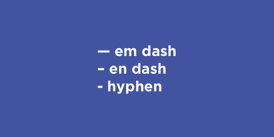
If you thought a dash was a hyphen, you’d be wrong. There are actually many different types of dashes — em dashes, en dashes, quotation dashes (to name only a few), and then yes, there is the hyphen (of which there are about ten different variations!). They have different uses, and they look slightly different too.
Here are the three main ones:
- Em dash: — (the longest dash)
- En dash: – (shorter than em dash)
- Hyphen: – (shorter than all dashes)
So what’s the difference between an em dash, en dash and a hyphen?
Visually speaking, as a designer, you only really need to know the difference between a hyphen and an em dash, as most users won’t really notice the difference between any other marks.
It should be noted that the visual differences between, say, a minus sign and a hyphen, might be more distinctive if you were using a certain style of font (with the “Arial” font, a minus sign and a hyphen will look almost identical, for example).
Okay, so what are they actually used for?
Let’s start with the most common mark, the hyphen.
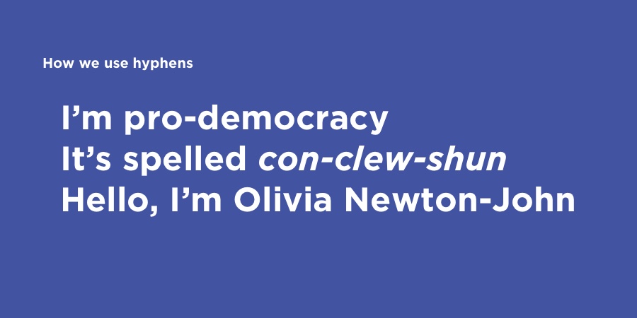
Hyphens are used to conjoin words in common phrases (such as “pro-democracy”). We call these words “compound constructions”. We can also use hyphens for pronunciations (e.g. conclusion: con-clew-shun).
Or double-barrel names (Olivia Newton-John).
Hyphens in copy shouldn’t be used to indicate a pause. We have full stops, commas and semi-colons for that; although, in some cases, these punctuation marks can actually have a negative impact. Here’s why:
Copywriting usually works best when it’s short and sweet, so the overuse of pauses makes the reader feel like you’re rambling on and wasting the reader’s time. Which brings me to dashes…
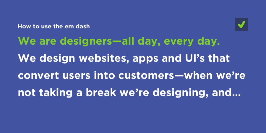
Em Dash
Since many of the dashes look pretty much identical, I’m going to focus on em dash (—) for this example, which is a little longer than most other dashes, and certainly longer (and more visually distinctive) than the ordinary hyphen (-).
Em dashes can be as a suitable alternative to traditional full stops/commas, and they can also make a bigger impact. An em dash creates a pause that isn’t as long as a full stop, but is longer than a comma or semi-colon. If your statement requires an extra sentence or two, then use commas to control the reading pace for better readability. If you only need to add a little extra context, then separate your final remark with an em dash — like I’m doing right now (look left).
Here’s a handy cheat sheet for displaying special characters and punctuation marks in HTML! Some of them are tricky!
Conclusion
While punctuation and grammar is the secret sauce to better content design, it’s still a relatively untouched aspect of designing for screens. That being said, designers are beginning to notice that copywriting plays an instrumental role in user-engagement and conversions. Perhaps we’ll see a rise in “copywriter/designer” roles in the next couple of years? Just kidding.


